

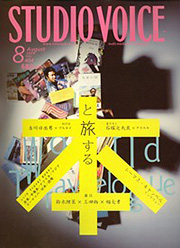
"Studio Voice", monthly culture magazine with a history of more than 30 years, will suspend publication after the current September issue (out since 8/6). "But didn't they sell more copies after the relaunch?" was a comment I heard quite often from people from the trade, but in addition to the ongoing structural recession in the publishing business, the fatal blow came with a decrease in advertising revenue due to the economic crisis that began to spread last fall. The management then supposedly decided that they would be "unable to continue". As I had browsed through almost all issues since the days of chief editor Sayama Ichiro, I am deeply concerned in various respects.
We stopped publishing the print edition of "ART iT" with volume 24 (out since 6/5) as well, and shifted the whole thing to the web. Probably thanks to the idea to add an SNS function, feedback on the online edition is very positive, and everything is going rather well. There are currently about 60 official bloggers — mainly artists — involved, and websites within the website introduce commercial galleries and other places that belong to our (presently) eleven "ArtPartners". The number of blogs and communities set up by registered members is rising daily. For someone who grew up with paper for over a quarter century, it’s really heartbreaking to stop putting out a printed magazine, but objectively speaking, the transfer to a full-fledged online edition was indeed well timed. Especially in terms of providing first-hand information in nearly real-time, the Internet is still the best medium, whereas paper has absolutely no chance here. Another advantage is that movies and sounds can be added directly and in a way that is much more convenient than attaching a DVD to a magazine.
Nevertheless, there is much that got lost. First of all, you will all agree that there is the materiality of paper and ink that the web has not. Furthermore, and more concretely speaking, there is the power of graphic design. Take the bold, clear-cut design of Sato Naoki & Asyl Design, for example, or Matsumoto Gento’s almost violent layout of the re-launched "Studio Voice". Especially the latter’s anarchistic layout ignoring all standards, using an audacious variety of typefaces including slanted letters, or eliminating the space between headline and text, is awesome. Not that this is impossible on the Internet of course, but it doesn't seem to go together with the promptness that makes the Internet so attractive (design takes time), so it’s really something that you can only get with paper. Graphic design on paper even lets us sense the movements of the designer’s hand at work.
In a nutshell, it’s about something like "physicality". Or perhaps an "introduction of physiology to design". When speaking of "materiality", you will probably understand it as a concept in which paper and ink are things separate from our bodies, but as a matter of fact, a book/magazine made of paper turns into somewhat an extension of our body the moment we hold it in our hands. That’s the crucial difference between printed and online publications, where the user does not touch the computer screen — unless it’s something with a touch panel. Actually, even in the case of a touch panel, the texture of the screen the finger touches remain constant regardless of the type of contents, so man and medium are absolutely unrelated.
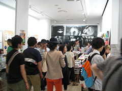
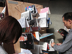
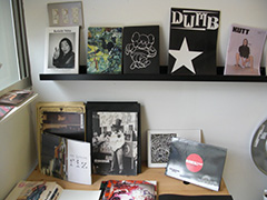
I'm hearing talk about independently published "zines" a lot recently, be it because more and more people share the same thoughts about what is gradually getting lost, or just coincidence. On 7/10-12, an event titled "Zine’s Mate: Tokyo Art Book Fair 2009" took place at Eye of Gyre and Vacant in Harajuku. Participants ranging from individual exhibitors to small commercial publishing companies were represented in about 70 booths. Commercial galleries such as Taka Ishii Gallery and Hiromi Yoshii were there as well, plus more than one hundred "Mixed Booths" in total, where participants without individual booths showcased their products. Both of the two venues were jam-packed, and according to the organizers, they counted more than 8,000 visitors in three days.
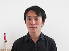
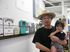
Eguchi Hiroshi, one of the initiators and organizers, comments in visible excitement, "A dream came true, and what’s more, it turned out even better than I had hoped." Eguchi is the man who launched "Utrecht", a unique shop dedicated mainly to visual-based books, and he has reportedly been dreaming of "doing something similar in Tokyo" since visiting the "NY Art Book Fair". Sales were not as the number of visitors would suggest though, so nobody walked home rich I guess. Anyway, Vacant has a permanent event space now as I learned, and Eguchi is eager to repeat the fair again next year.
The "Anarchy Art Book Center", an exposition/fair for "books that aren't available at book stores," opened on 7/18 at the "The Last Gallery" in Shirokane. The Last Gallery was opened by "Dune" magazine editor Hayashi Fumihiro, and this event is co-organized and co-hosted together with "Revisit" (http://www.revisit.jp/), an online store offering art books, zines and DVDs. According to the press release, "Independent media as part of the commercially catalogued mass media, are supposed to occupy an increasingly important position outside the system thanks to their freedom of expression and artistic qualities." Be that as it may, it does seem as if the number of creative people with a desire to publish their own media in a graphic format is increasing.
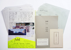
On 7/25, a magazine called "fold" was launched by a group centering around students of Tanaka Jun, an associate professor of Culture and Representation at Tokyo University. The magazine consists of A-4 sized slips of paper, B-5 sized booklets, postcards, and other things, bundled together in a folder with a very handmade appearance. The inaugural issue includes a questionnaire with such questions as "Where do you see the role of magazines in the age of the Internet?", and I replied the following. "In principle, there isn't much difference between both formats today. If I had to point out a difference, I'd say that print media carry less information, whereas it is difficult to make corrections. In other words, they involve '(greater) responsibility'. The advantage of design rooted in the characteristics of 'ink on paper' will probably remain for another while."
"The advantage of design rooted in the characteristics of 'ink on paper'" is the cause of the above-mentioned "physicality" and "introduction of physiology to design". Matsumoto Gento’s anarchistic design reflects a provocative attitude, as if he was challenging, "Now tell me you (the Internet) can do something like this!" In this sense, many of the zines introduced at "Zine’s Mate" and "Anarchy Book Center" left me rather unsatisfied. The design always reminded me of something I'd seen before.
A tight budget is no excuse. It’s much rather a reason for exploiting the limited means. I'm still waiting to see a high-spirited, well-designed print medium to surface that reflects the combination of "freedom of expression and artistic qualities" better than any existing magazine or website.
Ozaki Tetsuya / Editor in chief / REALTOKYO